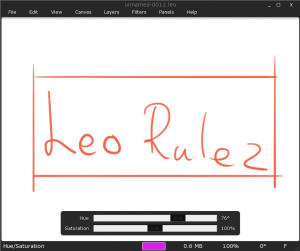
This is how Leonardo currently looks:
Yesterday, Daniel & Max was over and we did a user test on Daniel. Here is a list on things that probably should get addressed:
- Daniels initial reaction after lunching the application was something along the line: “What tool, brush and color do I currently have and how do I change it?” Daniel eventually figured all of this out, but it was not obvious from the start.
- When Max was experimenting around in Leonardo he zoomed out to ~15% and continue painting without realizing that he was at ~15% zoom. This was never a problem for Daniel though.
- Daniel wanted to draw a straight line but never figured out how to do it (it is obviously impossible for the user to know to hold down Q). Once I told him how to do it he instantly loved the way the “draw straight line tool” worked.
- When Daniel got the task: “convert your current painting to gray-scale” he did not realize that the command “Luminosity” under Filters does this.
- Both Daniel and Max wanted to create a new Canvas and start searching for “New…” under the File menu, but is not there…
- By mistake Max eyedropped white, he then resumed painting but did not realize he was painting with white and asked why nothing was happening.
- When Daniel was switching to Finite Canvas he thought it was strange that the canvas boundary did not get aligned with his current view.
- When Daniel should flip the image he flipped it vertically when he was supposed to flip it horizontally (an icon should probably make this much more obvious).
